- Declutter the Mobile App Design
- Include Familiar Screen
- Minimize Efforts for the Users
- Include Visual Aesthetics
- Add Consistency in Designing
- Finger-Friendly Targets
- Additional Tips to Keep in Mind
- Invest in Simple Navigation
- Include optional animations
- First-Time Experience Matters for the Users
- Create an Exceptional Onboarding Experience
- The Bottom Line

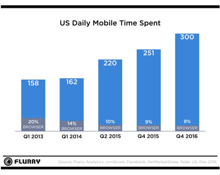
Flurry analytics has declared an average user spends 5 hours every day on mobile. And that shows the reality that a vast amount of user’s time is spent either on the applications or the web. But not all the mobile applications are making it to the handsets of the users. And the apps that are there on users’ smartphones have something extraordinary.
Today’s users want a lot from a mobile application. Not only do they look out for the latest UI design trends, but also the ease of interaction while engaging with the app, fast loading time, adoption of content, and the kind of actions included are primary for the success of the mobile application. That’s why mobile UI/UX design plays a crucial role in the development process.
The standards for developing an application are high today. So, what exactly is considered as “good experience” for the users? Let’s discuss in detail what goes into designing a mobile app, which will further explain the fundamentals of mobile UX design and development.
Declutter the Mobile App Design
A clear UI is every user’s delight and a component to let your mobile app step up the success ladder. Cut the clutter out of your mobile, and your app will become a favorite to the users. It is all about a clear mobile app design layout that appeals a lot to the users.
Overloading the application with too much information may seem like a bad idea as it is nothing more than adding so much to the mobile app interface that confuses the users. Therefore, it’s crucial for the app designers to stick to the mobile UI design guidelines.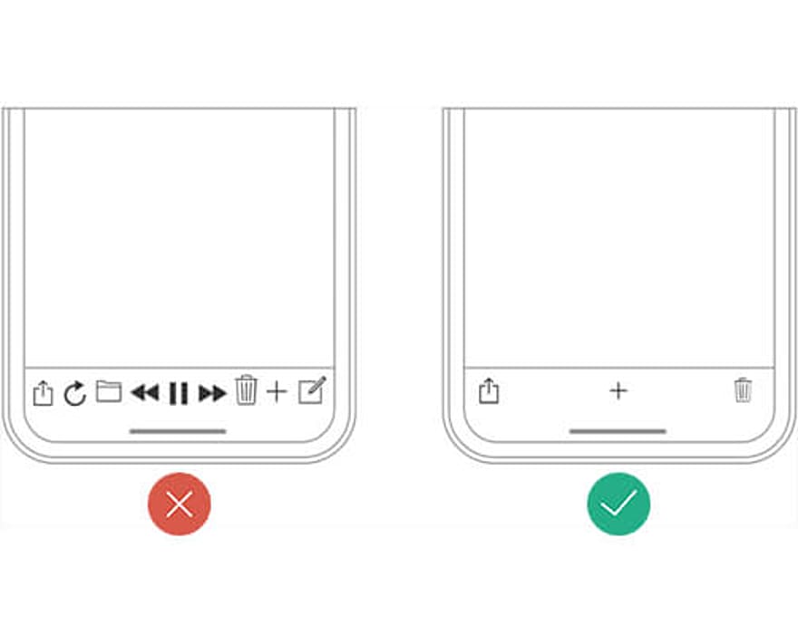
Pro Tips:
- If you want to cut out the clutter, add those elements only that are important. Try to be as minimalist as possible with the mobile app design implementation.
- For instance, when a user is about to make a choice, allow users to take actions but with minimal options.
- Add the choices in a single frame and then dive further into the details in the next screen(s).
- Use the progressive disclosure technique in your mobile app. Let the elements flow with the design frame by frame by showing the required options to the users with a free-flow interface.
Include Familiar Screen
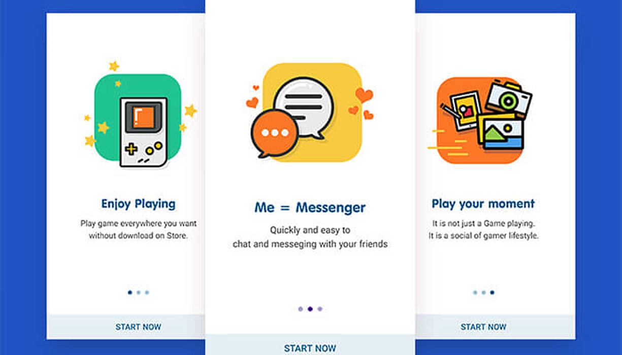
Including familiar screens for the users in an app states utilizing the “screen types” that users are already familiar with. These are the screens that users have seen in different other mobile apps too.
You must have come across many apps on the Google Play and Apple App Store having similar screens for “Search results,” “Gettings started,” and “What’s new.” Here is more on including such screens.
Pro Tips:
- Interactive interfaces (the ones explained above) have become the de facto design mobile app design standards.
- Add these specific screens as they don’t need additional explanation.
- And the icing on the cake, users strike familiarity with them.
- User’s prior experience of interacting with any of the mobile apps comes into use.
- That’s a significant relief to the users, no learning curve involved.
Instead, the mobile UI/UX design elements that come quickly to the users are sure to strike right into their minds. The mobile apps that ask them to learn first and then navigate through the elements are the hindrance for them to engage in the correct way with the users.
Minimize Efforts for the Users
Many mobile apps typically feature designs that are not very much comfortable with tapping at. You all know the pain that typing on a small smartphone screen brings with it. The pain is actually felt when users are given with any of the forms to fill the same.
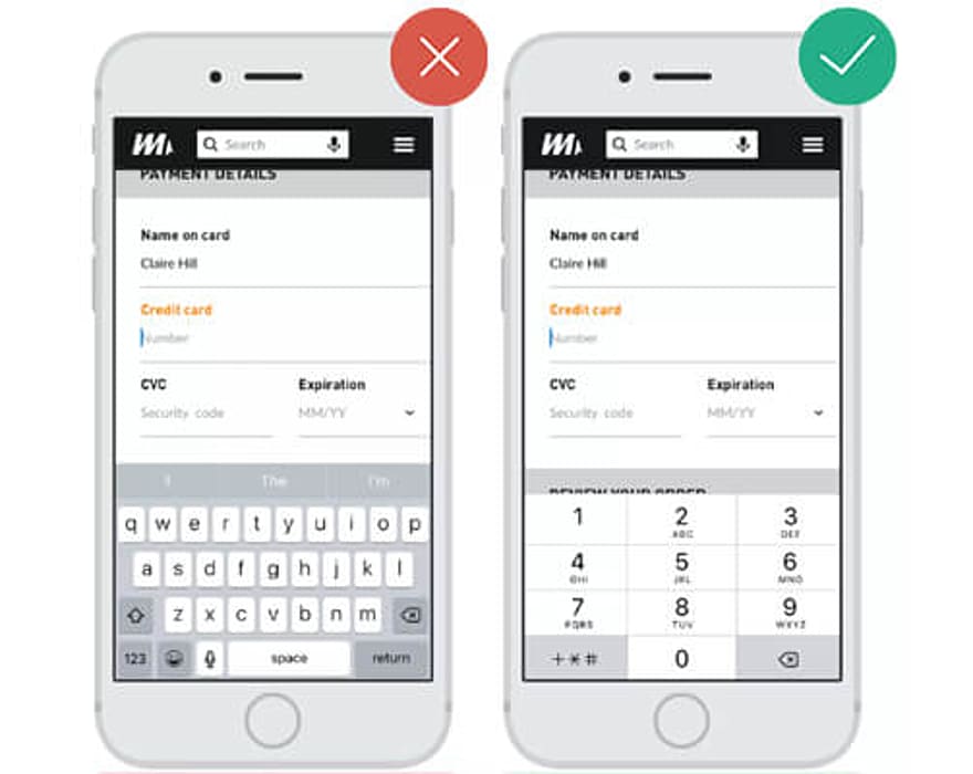
You may have encountered such a problem while filling a form on your smartphone. So, the ultimate solution is to minimize user input, and that can easily be done by removing unnecessary fields from the form.
Let’s take the example of payment gateways that users generally interact with when buying services from mobile apps. The best practice is to ask the required information only leaving all that is associated but not necessary, such as the user’s name and the details other than the card information. Here are some key caveats to keep along.
Pro Tips:
- Keep such forms as precise as possible. Remove unnecessary fields. Ask only the bare minimum details. Never bother your users.
- Utilize the input mask. It helps users to format the inputted text. For example, the elements that come along (autocomplete) in the mobile app or a form when users start filling the same.
- Help users notice the errors they might commit while filling information on the mobile application.
Include Visual Aesthetics
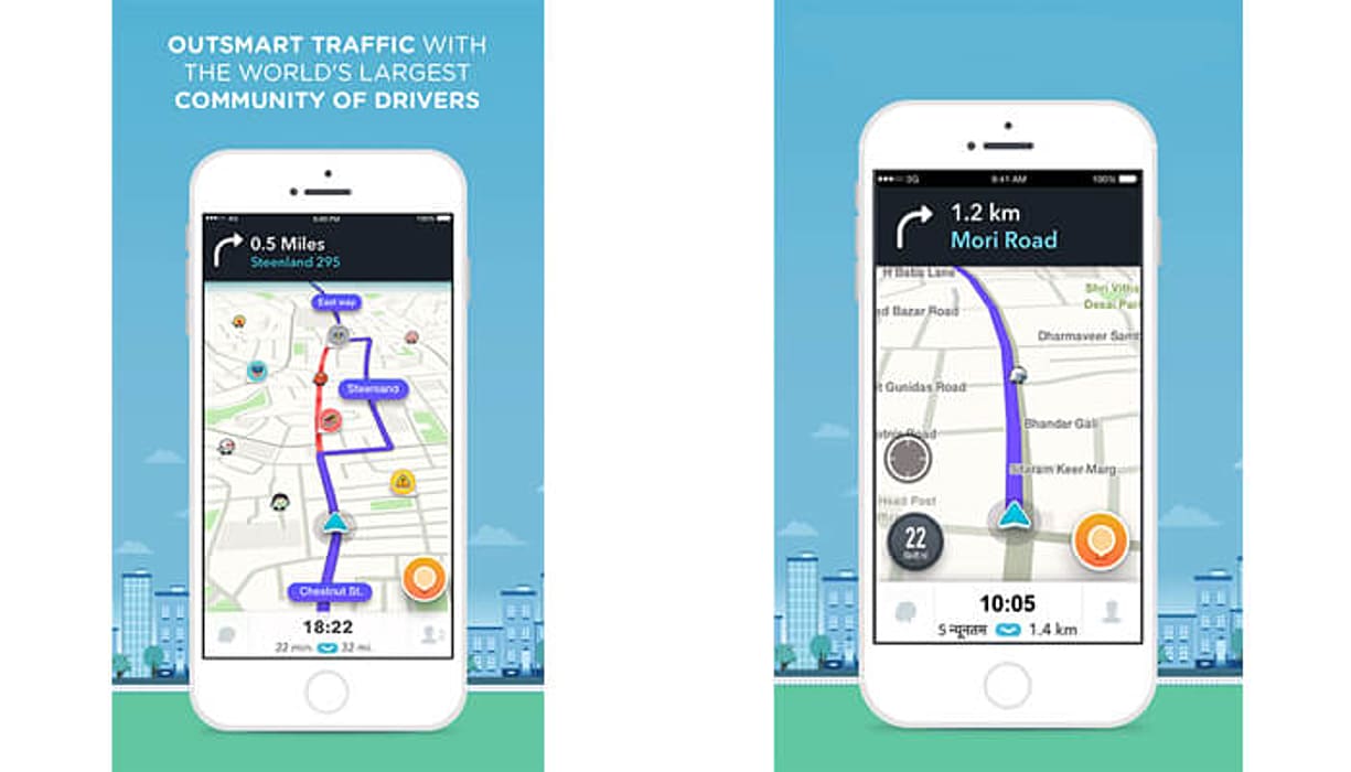
Let’s take the example of a ride-hailing app Uber that believes in the magic of including visuals aesthetics in its mobile app. Adding more weight to your app is possible by incorporating the visuals that define the mobile app design elements embedded within.
Visual aesthetics critically affects the minds and the decision-making of the users. In case, it goes well with the mobile app. You are sure to create success.
The importance of visual aesthetics in the mobile app design can easily be imported with the fact that not only navigational mobile apps but also other e-commerce apps including fashion and apparel, grocery shopping, and other such offerings provide to the users. Here are the ideas to keep in mind.
Pro Tips:
- Add the right color and the product size while developing the visual aesthetics
- Keep notice of the font you will be including; It greatly impacts the designing visuals
- Play with subtle interaction to make the things smoother for the users
- Let the users focus on the information by including uncluttered screens
Add Consistency in Designing
Consistency is prominent for the designers as it is the fundamental mobile app design principle around which things revolve in any mobile application. If there is consistency in the design, it gets more accessible for the users to navigate through.
And that makes it prominent to maintain an overall consistency throughout the app. Keep the following suggestions in mind to explore new mobile app design layout avenues.
-
Functional consistency
These are the interactive elements that work in the different mobile app section
-
Visual consistency
This includes typefaces, labels, and the buttons
-
External consistency
A consistent mobile app design across the mobile app to help users feel accustomed to the same.
Pro Tips:
-
Implement design as per specific OS guidelines. Apple and Google differ a bit in their mobile design guidelines.
-
Show consistency (design) in the mobile app and website. Make sure all of the offerings from your side have similar characteristics (the design functionality).
-
The navigation and the color scheme should follow a similar mobile app design
Finger-Friendly Targets
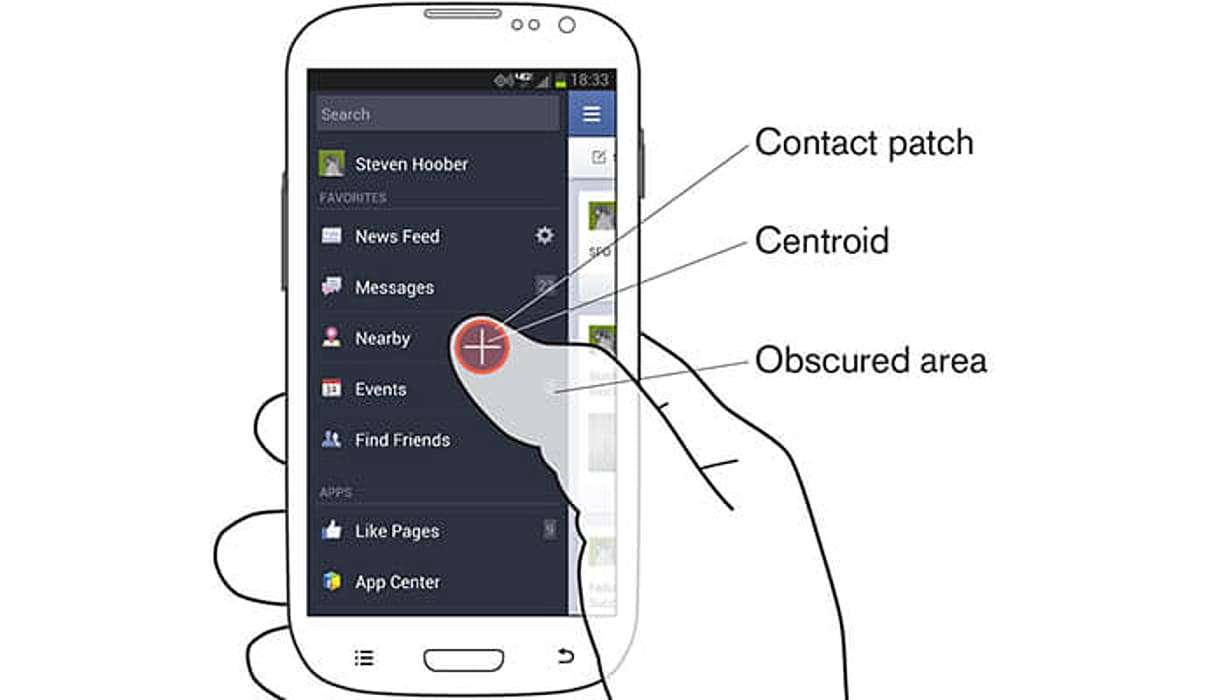
The actionable mobile elements in the interfaces should be created as targets prominent enough to make the tap easier for the users. The thumb rule says the mobile app design controls must have the touch area of 7-10 mm. It is to ensure that users could tap the icon easily with the fingers. And this is possible only when the target edges are visible to the users.
Keep a close look at the elements and make sure they are not located too closely. The spacing matters in between every tap target so that users could not click the incorrect targets.
Pro Tips:
-
Consider thumb and finger-friendly interactions in the mobile app
-
Include natural thumb zone while developing the mobile app interface design
-
Never add the inputs that would require users to stretch their fingers to make actions
Additional Tips to Keep in Mind
While we are done with the basics that mobile app developers should keep into the mind while creating mobile apps, let’s skim through other important points.
Invest in Simple Navigation
Helping users navigate easily is one of the high priorities for the developers. The aesthetic of your mobile app won’t matter if the users are not able to find the same. So, take time as well as efforts to decide on how to implement a navigational strategy in your product.
If it is taking too much time and effort from your users to browse through the product, there are chances that you may lose the users. The product (either the mobile app or a website) should be crafted in a way that the developers need not explain the primary tasks to the users.
Include optional animations
The user’s opinions are divided when it comes to perceiving animation. Those suffering from motion sickness often turn off the animation settings from their respective OS. So, it is advised to make animation optional for the users in an app.
Your product must have the settings to minimize the effects and aftereffects. So, when such options are enabled, the product either minimizes or eliminates the animation on its own.
Offering a handful of options to users and then asking them for the choices is something that developers must keep into the mind.
First-Time Experience Matters for the Users
The first time experience can either make or break the impression for the users. As a product designer, you only get one chance to interact with the users to impress them, so make this chance count.
Even if you fail, the users will get notice of your mobile application, and you never know they may download the same in the meantime. So, invest proper time as well as efforts to make an impression that is long-lasting on the users. Effective icons, beautiful aesthetics, and consistency in the product can help you achieve the goal easily.
Create an Exceptional Onboarding Experience
Delivering an onboarding experience that is phenomenal for the users is as important as any other element. In regards to the mobile UX, an excellent onboarding experience is the foundation stone that could retain the users.
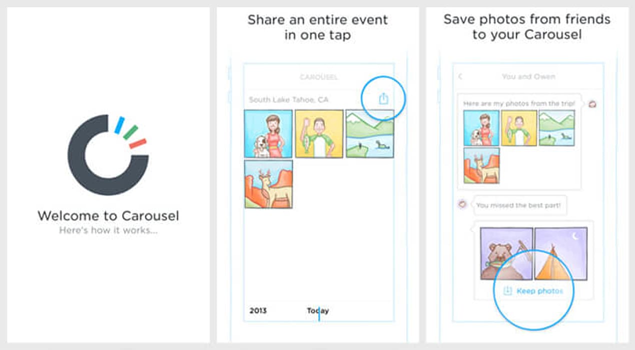
The onboarding experience of your product shows the typical value it has for the users. Try to implement contextual onboarding (information that is only revealed when the users need it). Thus, the information is only given when the users ask the same. Here is an example to show the aspects of contextual onboarding.
The Bottom Line
Great design is the confluence of aesthetics, functionality, and the features a mobile app has for the users. And that is what every developer should focus on the latest trends while creating a product. Treat your product as an opportunity to evolve further after every launch.
Designers often strive to create invisible interfaces because mobile app interface design has the potential to satisfy the users, along with providing them with excellent delivery in terms of exceptional user experience.
Just like any other guide, we have tried to keep designers informed about the UX and UI design principles that are prevailing in the industry. This guide was an extended attempt to include everything that creators must keep their eyes on.
Frequently Asked Questions

By Sakshi Kaushik

Content Writer (B2B Editorial)
A passionate writer and tech lover, she strives to share her expertise with mobile app developers and fellow tech enthusiasts. During her moments away from the keyboard, she relishes delving into thriller narratives, immersing herself in diverse realms.


